HIDE THE DECLINE - THERE WAS A DECLINE AND IT WAS HIDDEN

The following article is an attempt to explain the picture shown above and its implications.
The picture - which in most browsers is an animation - combines two graphs to make them easier to compare.
If it isn't an animation, then look at the pictures below called:- "Picture A" and then "Picture B"
Below is a very good video that covers this in detail.
Climategate 'hide the decline' explained by Berkeley professor of Physics Richard A. Muller
HIDE THE DECLINE
The ‘trick’ in question was:-
 However, the treemometers didn't show the same temperatures as the thermometers. Beginning in about 1960 the tree-mometers showed temperatures to be falling whereas therm-ometers showed temperatures to be rising. The tree-mometers showed temperatures that were declining, but the therm-ometers showed temperatures that were inclining.

The scientists didn't want the treemometers to show a decline, because this was the exact opposite of what the thermometers showed. So they altered the treemometer graph so as to
 They did this so that they could pretend that the tree-mometers showed temperatures that were exactly the same as the thermometers. This trickery was necessary so that they could pretend that the treemometers were just as accurate and reliable as the thermometers.

The upshot of these alterations is to change evidence that tree-mometers are really bad thermometers (so bad that they show a decline when therm-ometers show an incline.) into evidence that tree-mometers are staggeringly good thermometers (so good that they show an incline that exactly matches the incline showed by thermometers).
The reason that the two inclines match exactly is that they are made of exactly the same temperature data. The scientists have taken the therm-ometer data and spliced it onto the end of the tree-mometer data in order to create the illusion that it IS tree-mometer data.
The scientists don't just hide a decline in tree-mometer data, they also fake an incline.
If you look again at Picture A, you will notice that it shows a decline but not an incline.
If you look again at Picture B, you will notice that it shows am incline but not a decline.
The viewer is tricked into NOT knowing that tree-mometers are very, very bad thermometers AND also tricked into mistakenly "knowing" that tree-mometers are very, very good thermometers
THIS DISHONESTY WAS REPEATED AND SYSTEMATIC
Keith's "Science Trick " (ie the omission of part of the data and also the addition of some more) was systemic in the peer reviewed literature as well as the IPCC Third Assessment Report ("TAR") and the IPCC Fourth Assessment Report IPCC ("AR4").
Examples include:
The hockey stick was featured SIX times in the IPCC’s Third Assessment Report (TAR).
My point here is that this was not a "single lapse of judgement". It was something that went on for over a decade.
And another analysis with more than 1000 comments at :- http://judithcurry.com/2011/02/22/hiding-the-decline/
Explaining the pictures in this article
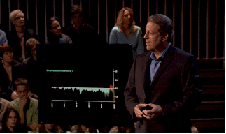
The animated pictures above were extracted from a video presentation given by Professor Richard A Muller at Berkeley in 2011. Prof Muller is a physicist, director of the Berkeley Earth Project, and has a pro-climate alarmist bias, so - if the pictures are biased at all - then that bias should be in favour of Catastrophic Man Made Global Warming.
Picture A above shows what the IPCC graph should have shown - the decline that was hidden
Picture B above shows the graph that the IPCC actually published - the graph that "hides the decline." and fakes an incline.
Picture C shows the two combined for comparison purposes
There have been eight committees that have investigated the allegations about Climategate and its hiding of the decline. All have published reports which claimed to find no evidence of fraud or scientific misconduct
There is a detailed transcript of the documentary above here at:- http://www.corbettreport.com/articles/20091125_enviro_message.htm


[Back to Main Index]
The picture - which in most browsers is an animation - combines two graphs to make them easier to compare.
If it isn't an animation, then look at the pictures below called:- "Picture A" and then "Picture B"
The picture on the left is the graph that the IPCC should have shown - it shows the decline that was hidden Notice that this picture shows a decline but not an incline | The picture on the right is what the IPCC actually published - the graph that "hides the decline." Notice that this picture shows an incline but not a decline |
Below is a very good video that covers this in detail.
Climategate 'hide the decline' explained by Berkeley professor of Physics Richard A. Muller
HIDE THE DECLINE
The phrase "hide the decline" (a famous part of "Climategate") comes from the following remark in an email from Phil Jones to Mann, Bradley and Hughes in November 1999 :-
"I’ve just completed Mike’s Nature trick of adding in the real temps to each series for the last 20 years (ie from 1981 onwards) and from 1961 for Keith’s to hide the decline. "Phil Jones is referring to a graph for the 1999 World Meteorological Organization (WMO) report which is the one depicted above - although the more important "Hidings of the Decline" were in the IPCC Third and Fourth Assessment reports.
The ‘trick’ in question was:-
- deleting the post-1960 values of the Briffa reconstruction,
- replacing them with the temperature values measured by thermometers,
- smoothing the splicing together of the series to disguise the join, and
- ending up with a reconstruction that looked like an accurate reconstruction of late 20th-century temperatures as measured by thermometers
The "Trick" explained in really simple terms :-
Proper Thermometers didn't exist a thousand years ago and so it is not possible for them to have been used to measure the temperature back then. So some scientists decided to infer the temperature from the size of tree rings - creating what could be called a "tree-mometer." These treemometers were used as a "proxy" form of thermometer - a way of measuring the temperatures before thermometers had been invented.
(Picture A:- Graph of treemometer temperatures showing a decline of temperatures)
- hide the decline which the tree-mometers actually showed and
- fake an incline. Pretend that the treemometers showed an increase in temperatures. Create the illusion that the tree-mometers showed the same temperatures as the thermometers.
(Picture B:- Graph of treemometer temperatures falsely showing an increase of temperatures)
PICTURE C
Picture C above should be an animation that shows first Picture A and then Picture B so as to make the comparison easier - it shows the decline that was hidden and then hides it.
Some scientists used a trick to make people think that the tree-mometers showed the temperatures to be increasing, when in fact they showed the temperatures to be decreasing.
They used one trick to trick people into not knowing about a decline. This first trick was cutting off the treemometer data at 1961, so as to hide a decline.
They then also used another trick to trick people into thinking that there was an incline when there wasn't one at all. (In fact, as we have seen, there was a decline.)
This second trick was splicing the therm-ometer data onto the end of the tree-mometer data to make it look as though the tree-mometers showed exactly the same temperatures as the thermometers.
This is the trick of "adding in the real temps to each series..."
This second trick involves changing a cooling trend into a warming one. It involves taking a lower temperature that is declining and REPLACING it with a higher temperature that is inclining. It involves dishonestly raising the temperatures shown on a graph, making it look as though the tree-mometers showed hotter temperatures than they actually did.

The upshot of these alterations is to change evidence that tree-mometers are really bad thermometers (so bad that they show a decline when therm-ometers show an incline.) into evidence that tree-mometers are staggeringly good thermometers (so good that they show an incline that exactly matches the incline showed by thermometers).
The reason that the two inclines match exactly is that they are made of exactly the same temperature data. The scientists have taken the therm-ometer data and spliced it onto the end of the tree-mometer data in order to create the illusion that it IS tree-mometer data.
The scientists don't just hide a decline in tree-mometer data, they also fake an incline.
If you look again at Picture A, you will notice that it shows a decline but not an incline.
If you look again at Picture B, you will notice that it shows am incline but not a decline.
The viewer is tricked into NOT knowing that tree-mometers are very, very bad thermometers AND also tricked into mistakenly "knowing" that tree-mometers are very, very good thermometers
THIS DISHONESTY WAS REPEATED AND SYSTEMATIC
Examples include:
- The spaghetti graphs in Briffa and Osborn (Science 1999),
- Jones et al (Rev Geophys 1999),
- Briffa et al (JGR 2001) Plate 3,
- Jones et al 2001 Plate 2A,
- Briffa et al 2004 Figure 8,
- Hegerl 2007 et al Figure 5b.
The hockey stick was featured SIX times in the IPCC’s Third Assessment Report (TAR).
- Figure 2.21 (of the TAR)
- Figure 2.20
- Figure 5 in WG1 Technical Summary B
- WG1 Summary for Policymakers
- Synthesis Report - Summary for Policymakers
- Synthesis Report - Questions.
My point here is that this was not a "single lapse of judgement". It was something that went on for over a decade.
- 1999 Jones prepared the cover of a WMO report deleting the post-1960 portion of Keith Briffa's data to hide the decline, and replacing the data with temperature records, then smoothing over the splice so it is concealed. (as depicted here above in pictures A and B)
- 1999 IPCC authors are bothered that Briffa's graph after 1960 diverges from the apparent temperature record, and if they include it in the Third Assessment Report it will detract from the message. So they include it but they delete the post-1960 portion
- 2001 IPCC TAR published with Keith's post-1960 data deleted, no notice to reader
- 2006 NAS Report offers no explanation for the divergence problem
- 2006 IPCC draft for AR4 includes cluster of reconstructions, including Briffa's, with post-1960 portion deleted. Reviewer Steve McIntyre demands they show all the data
- 2007 published IPCC report omits post-1960 data; mentions data deletion in chapter text but does not establish a rationale
And another analysis with more than 1000 comments at :- http://judithcurry.com/2011/02/22/hiding-the-decline/
Explaining the pictures in this article
The animated pictures above were extracted from a video presentation given by Professor Richard A Muller at Berkeley in 2011. Prof Muller is a physicist, director of the Berkeley Earth Project, and has a pro-climate alarmist bias, so - if the pictures are biased at all - then that bias should be in favour of Catastrophic Man Made Global Warming.
Picture A above shows what the IPCC graph should have shown - the decline that was hidden
Picture B above shows the graph that the IPCC actually published - the graph that "hides the decline." and fakes an incline.
Picture C shows the two combined for comparison purposes
More Politics of Catastrophic Man-made Global warming.
There have been eight committees that have investigated the allegations about Climategate and its hiding of the decline. All have published reports which claimed to find no evidence of fraud or scientific misconduct- House of Commons Science and Technology Committee (UK)
- Independent Climate Change Email Review (UK)
- International Science Assessment Panel (UK)
- Pennsylvania State University (US) (twice)
- United States Environmental Protection Agency (US)
- Inspector General of the U.S. Department of Commerce
- National Science Foundation
Not even one of these investigations found anything wrong with the "hiding of the decline" shown above.
These eight whitewashes - these eight examples of political dishonesty - provide yet more evidence that there is some very powerful politics in action here. More evidence that the Catastrophic Man-made Global Warming hoax has immense political backing.
The fix is in.
The con is on.
The dice are loaded.
The table is tilted.
The game is rigged.
Conclusion
The best summary of the situation is given, as usual, by James Corbett.There is a detailed transcript of the documentary above here at:- http://www.corbettreport.com/articles/20091125_enviro_message.htm
More Information about how publicised the Hockey Stick graph was.
This has to have been the most publicised graph in history.
Release of the (MBH98 Hockey Stick) paper on 22 April 1998 was given exceptional media coverage, possibly due to the chance that this happened to be Earth Day and it was the warmest year on record. There was an immediate media response to the press release, and the story featured in major newspapers including the New York Times, USA Today and the Boston Globe. Later reports appeared in Time, U.S. News & World Report and Rolling Stone. On one afternoon, Mann was interviewed by CNN, CBS and NBC.
Also:-
(2002) McIntyre says that the hockey stick graph was displayed in a pamphlet that was sent to every household in Canada (in 2002) as part of the Canadian government trying to persuade Canadians to accept the Kyoto Protocol. The Canadian government ratified the Kyoto protocol in 2002, but then withdrew from it in 2011. The United States, under President George W. Bush, had pulled out of the Kyoto Protocol in 2001
Also:-
In 2005 IPCC WG1 Co-chair Sir John T. Houghton showed the IPCC fig. 2.20 hockey stick graph at a climate conference.
Also:-
In 2005 Republican Congressman Joe Barton - in his capacity as chairman of the House Committee on Energy and Commerce - wrote to the authors of the Hockey Stick graph. His letters talk of "methodological flaws", "data errors", and of questions about the authors' willingness to share their data.
Mr Barton also wrote to the chair of the Intergovernmental Panel on Climate Change (IPCC), which reproduced the hockey stick in its 2001 scientific assessment of global warming, and to the director of the National Science Foundation, which funds much of the climate science done in the United States.
Also :-
The hockey stick graph was used in Al Gore's movie "An Inconvenient Truth" (2006)
In 2007 the IPCC and Al Gore win The Nobel Peace Prize "for their efforts to build up and disseminate greater knowledge about man-made climate change, and to lay the foundations for the measures that are needed to counteract such change."
Stephen McIntyre and Ross McKitrick
Canadians Stephen McIntyre and Ross McKitrick were two important figures at the heart of the the dismantling of the "Hockey Stick" graph (of which the "hide the decline" is just a part)
The deletion of "the decline" from the IPCC diagram was not noticed publicly until 2005, when it was reported in an article at Stephen McIntyre's blog called Climate Audit
In 2004, Ross McKitrick of the University of Guelph and Steven McIntyre filed a "Material Complaint" to Nature **McIntyre, S. and R. McKitrick (2004). "Materials Complaint Concerning MBH98"Nature 430 July 1, 2004, p. 105.
As a result, Nature issued a Corrigendum in July 2004 which was a correction of Mann’s hockey stick. They (Mann etc) acknowledged that McIntyre and McKitrick had pointed out extensive errors in the description of the Mann data set, and conceded that key steps in the computations were left out and conflicted with the descriptions in the original paper.”
In 2006 S Fred Singer and Ross McKitrick held a press conference in Washington
"The Summary for Policy Makers, which is what most non-scientific types will read, is especially distorting and misrepresentative of the full report, said Singer. He added that the Summary is mainly a "political document...." (said S Fred Singer).
The full cost of the Kyoto Protocol could run as high as $5 trillion, said Ross McKitrick, an economist at the University of Guelph in Ontario, Canada.from:- https://cnsnews.com/news/article/scientists-say-global-warming-theory-lot-hot-air
"Climate alarmists put the policy cart in front of the science horse," said McKitrick. "Even if global warming is happening, or is about to happen, and we decide its net effects are mostly bad, there are many feasible policy options to deal with it.
Perhaps the worst aspect of Kyoto is that it won't help the environment, said McKitrick.
"The Kyoto Protocol, for all the enormous costs it will impose on nations and our global economy, will have no discernible impact on the climate change process," said McKitrick.
"Why are we in such a hurry to adopt an incredibly expensive policy, which is a completely futile attempt to influence a process that we can neither predict, identify, measure, nor control," he added.
I recommend the diligent researcher to read :-
Which is a retrospective and evaluation of the issues raised by Climategate and the inquiries that followed from it. (published in 2019 by Ross McKitrick)
and also visit
(2019). "This is the most in-depth interview with Steve McIntyre ever to be published"
If the IPCC deserved a Nobel Peace Prize, then McIntyre and McKitrick deserve it more.
Professor Tim Ball
Also worth a very honourable mention is Professor Tim Ball, another Canadian. He was sued by Michael Mann (an author of the Hockey Stick paper and graph) but the case was thrown out of court when Mann refused to supply the court with the data it requested. Prof. Ball was awarded significant costs.
Professor Ball also won a libel case in 2018 brought by British Columbia Green Party leader Andrew Weaver
In his book "Human Caused Global Warming The Biggest Deception In History" (2016), Dr. Tim Ball <is said by one reviewer to have> named the threefold motives of the Big Envitronmentalists
* A vast depopulation.
* De-industrialisation.
* A totalitarian world govt.
This de-industrialisation requires the destruction of the middle class and the impoverishment of all the survivors back to serfdom.
Dr Ball has a more complex and complete discussion in his larger book "The Deliberate Corruption of Climate Science
Mark Steyn
Journalist Mark Steyn was also sued by Michael Mann.
But Mark Steyn then COUNTERSUED Michael Mann citing "freedom of speech and (the) stifling of legitimate criticism"
See here for more :- https://judithcurry.com/2014/02/22/steyn-et-al-versus-mann/
Esteemed American climate scientist, Dr Judith Curry, has submitted to the court an Amicus Curiae legal brief exposing Mann.
These court cases have still not been resolved as of Feb, 2020.
Mark Steyn has also written a book called A Disgrace to the Profession
This book is a collection of highly critical comments by scientists of varying degrees of eminence concerning Michael Mann and his (in)famous "hockey stick" temperature graph. The book emanated from a still-ongoing lawsuit that Mann filed against Steyn for writing in a National Review Online article that the hockey stick was fraudulent.
This book is a collection of highly critical comments by scientists of varying degrees of eminence concerning Michael Mann and his (in)famous "hockey stick" temperature graph. The book emanated from a still-ongoing lawsuit that Mann filed against Steyn for writing in a National Review Online article that the hockey stick was fraudulent.
Andrew Montford
Andrew Montford’s "The Hockey Stick Illusion"(2010) is one of the best science books in years. It exposes in delicious detail, datum by datum, how a great scientific mistake of immense political weight was perpetrated, defended and camouflaged by a scientific establishment that should now be red with shame. It is a book about principal components, data mining and confidence intervals—subjects that have never before been made thrilling. It is the biography of a graph.
from:- Matt Ridley
[Back to Main Index]
No comments:
Post a Comment